Lately we have been making an effort to offer people our own professional opinions on what is a good paper type to choose for their image. I think I have mentioned in the past that one of the most popular questions people ask us has to do with what paper we think will be best for their artwork or photography. I had the practice of just telling people that it is really up to them since so often personal preference plays a role. But unfortunately that is not the answer most people want to hear. Looking back, I completely understand, especially if printing your work is something you only do on occasion. So what I would like to do is tell you how we come to the conclusions that we do to determine which paper is best suited for the type of print you want.
I need to first begin by telling you that by no means is this advice 100% applicable in all scenarios but I can safely say based on the years of experience in the fine art printing industry this is what I have come to discover seems to work well in deciding what paper you should choose for your artwork, whether it be a photograph or a reproduction of a painting. Second, I need to emphasis the point about not all papers are created equal. This means that if you like how your artwork or photography prints on one particular paper you may or may not like how it looks on another. Slight color shifts may appear if you were to compare and you may have a warmer or cooler toned print depending on the amount of white or whiteness of the paper itself. Take a look at the following video which does a great job of explaining this in more detail.
This week a John, a photographer I know from a photo club we sponsor visited us to have us print an impressive black and white photo he had digitally converted to look more artistic. John had wanted to see some of our papers and see what I thought would be a good choice for the image. After inspecting the image file he concurred with me in deciding our Hahnemuhle Torchon would best serve the image. While the image had a lot of detail I felt that what really needed to stand out was the contrast within the image itself which was the basis for my opinion.
So what was my pattern of thinking or how did I come to this conclusion? There was a full range of blacks to white in the image so I knew that the print needed to have a high dmax level. Dmax is simply defined as the blackest a print can get. I have always felt that with black and white photography this is crucial. With papers in which actual ink is bonding to the surface the dmax level is dependent on how absorbent the paper is and even the whiteness of the paper. Since the image needed to “pop” as they say in photo circles, I felt a paper with a high dmax made the most sense.
Texture level is another factor in determining how well an image will do. A common mistake I see some artists do (I use the word mistake lightly since it’s not always a real big deal) is to choose a very textured paper for when reproducing a painting that itself had a lot of texture (brush strokes, raised paint daubs or even underlying canvas). When I see an image like that and they do not want to print it on canvas I encourage a smoother paper in which there is no texture so you can see the original artwork’s texture.
Generally we try to look at the content of the image to make the determination. What I mean is the tones and hues of the image itself. For instance a picture with a lot of brighter colors do not necessarily need a high dmax paper unless there are also a lot of darker colors in the mix. An image that is very dark might be better suited on a high dmax paper but only if the image is intentionally dark. I raise this point because all too often people’s images are darker than they think because they are relying on a poorly calibrated monitor or one which is overly emitting brightness.
To help you determine which paper might be most suitable, we have updated some of the technical specifications on the different papers to better reflect both the black and white capabilities plus the dmax and color gamut level. You can view this by clicking on the “Technical Specifications” on any of the papers we offer.
For black and white capabilities we have labeled our papers from “Poor” to “Average” to “Excellent”. Poor would mean that you won’t get a decent black and white (grayscale) image if you wanted it printed that way. Average may mean a slight color cast which is usually dependent on the particular printer capabilities and whiteness of the paper (for instance you will get a slightly warmer toned print on a more natural white versus a bright white). Excellent simply means a perfect black and white void of any noticeable color cast. Black and white is one of the most difficult things to print well because the printers have to simulate a grayscale using a proper mixture of colors. For instance our printer profiles for a warmer tone paper may use some more color tones in the inks to offset that to give a more gray scale appearance.
For color images, you will want to pay more attention to the Dmax & Color Gamut Levels that can be achieved. We decided to combine these for now because we find that usually they go hand in hand. The papers which display deep rich blacks tend to also be the ones that have the highest range of color. All the papers have at least “Good” rating with some of them like the Metallic and Satin Luster papers having “Excellent”. Normally the ones rated excellent are going to be on a glossy surface where the inks are less likely to be absorbed by the paper and more likely to stay on the surface. Where this exception is seen is with our two Hahnemuhle papers like the Torchon and William Turner. I don’t know what Hahnemuhle does but whatever it is, they sure do it right because even those these are matte papers, the color range is outstanding.
Opinions on papers under difference scenarios can change. By no means are these static. As we upgrade printers, we may need to update how we rate the various papers when it comes to their ability to display colors. Usually any changes from printer to printer are very incremental but you may find that a paper you did not like two years ago, display your images much better on that same paper today.
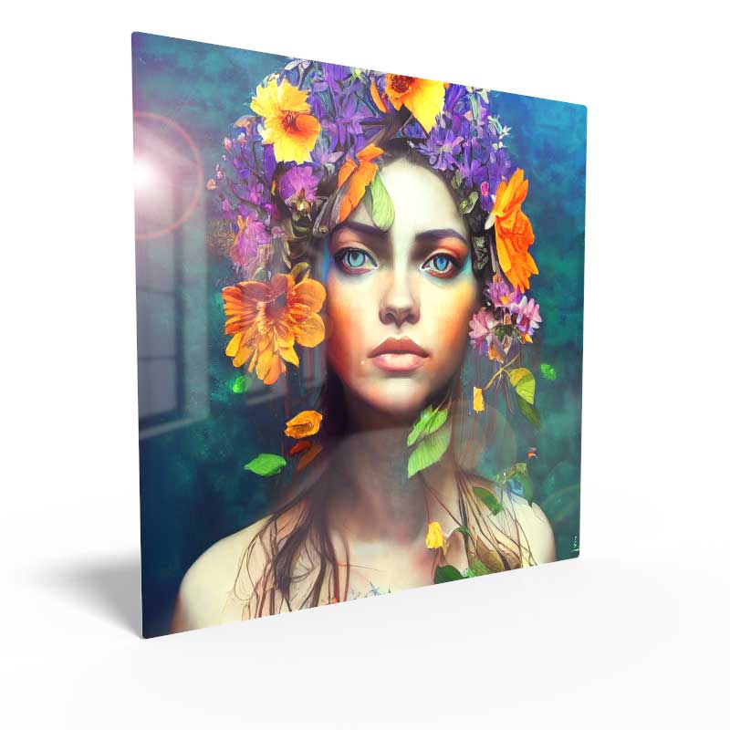
Order HD Chromaluxe® Metal Prints
Print your artwork or photography as custom-size metal prints. Using the dye-sublimation process, your image is fused to the surface of rigid aluminum panels. These provide a modern look when decorating your home or office. Choose from multiple metal surface options. Order it framed, with a float wall mounting or even with a tabletop easel back.