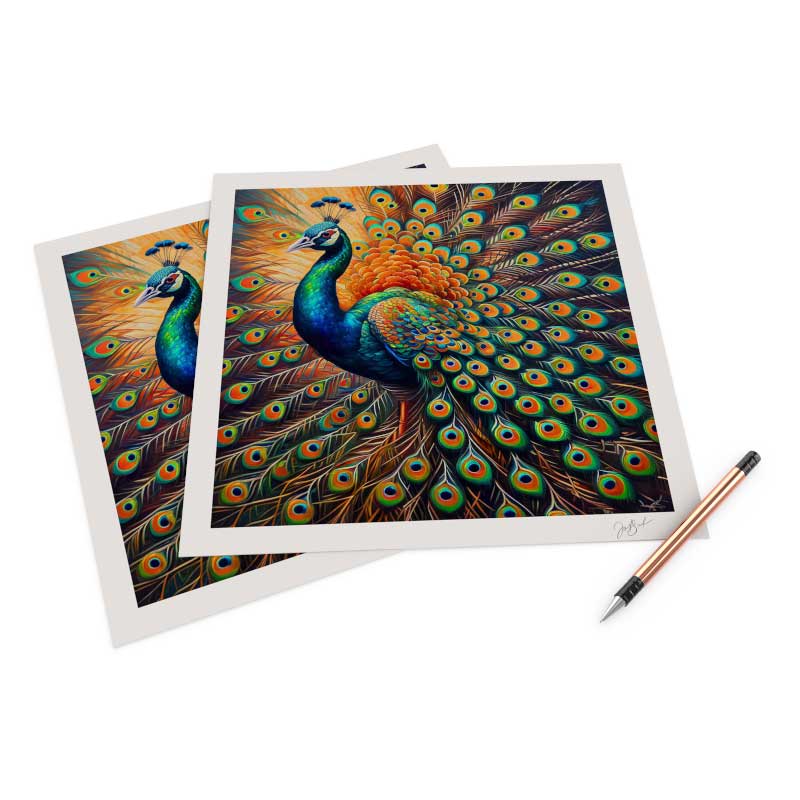
Anyone who prints either at home or hires a professional giclee printing service like FinerWorks.com should concern themselves with color accuracy and be aware of an occurance in every print of something called "metamerism". What is metamerism and how does it affect the color accuracy of your print? Metamerism is a term in the printing industry that describes the ability of colors to retain their perceived accuracy regardless of the light source a print is being viewed. Everything with color is going to be subject various levels of difference in color under differing light conditions. That is why an original work of art and print can look ientical under one light source and show remarkable differences under another light source. To make it more of a challenge, both the colors of the original and the print can change in differing light sources.
A few months ago I was going over the process of softproofing with a customer so he could work on bringing out some more detail in some dark areas of a canvas print. We were not in the most optimal enviorment to do this because the room was lit with a series of florescent lights and the monitor was due to be recalibrated. What we were seeing on screen was still quite close but I noticed a batch of blue in the image that looked great on screen but not so much in print. The blue in the print seemed to have a more purplish cast. After I pointed that out to him, he said he had done that print before but it did not recall ever seeing the blue tend toward a purple tone. This is where I brought up the term metamerism, or in this case illuminant metameric failure (IMF). IMF may be used to describe situations where a color shift can occur under certain lighting conditions. Flourescent lights are some of the biggest culprints in causing this to happen. What occurs is the type of light and wavelenghts produced by fluorescent light bulbs are different then other lights.And incandescent lights produce different wavelengths of color than natural sunlight. To show him what I meant, we walked outside with the print and looked at it in natural sunlight. In daylight the blue in question looked exactly like we would expect.
Back in the days when I first ventured into canvas printing, this was a big problem with the printers and inks we had available to us. Since the engineering of the Epson Ultrachrome and Canvas Lucia Inks, which we use today, the frequency of this being noticable has decreased dramatically. Unfortunately there is not much you can do about this when it is so obvious beyond taking the image into Photoshop and actually tweaking the colors for the enviorment the print will be display. I suspect we will see this be a less of an issue as companies refine their inks which are used for art reproductions and fine art photography prints. If feedback I receive now is any indication, I think this is not been as much of an issue because of superior inks used today.
Notice at the start of this post I mentioned “perceived accuracy”. That is because there is also a such thing as “observer metameric failure” (OMF). OMF is probably the least mentioned when it comes to color accuracy but should not be overlooked. OMF is where different individuals perceive colors differently. In the extreme sense this could be called colorblindness but it occurs in all of us to a degree. You may also think a print has perfect color while others think it will need some work. I have produced prints myself which I thought came off the printer perfecly, but later when looking it at home think I should have adjusted the color more.
Finally if you are into soft proofing your prints, you may have fallen victim to how metamerism works. One thing not given enough attention to soft proofing is the need to not only calibrate your monitor but to calibrate it to the light source where the print will be displayed. Calibration tools take a measurement of ambient light. While that is great to know, how often is the print being produced going to be displayed in the same light conditions as the monitor? This is just some food for thought when it comes to color matching your prints.
The bottom line is if you are printing your work yourself, with us or another company, be aware of the role lighting plays in color matching. Even the best color match print can look different from an original in some instances and match it very closely in other instances. Don't let it get you down if it does happen. After all, it is only a copy.
Giclee Printing at FinerWorks
One of the largest ranges of paper selections, while using the highest level of archival print technology allowing superior detail and color, you can create custom giclee prints of your artwork and photos.
