I trust color about as much as I trust the news to get every story right the first time. Ironically I saw something in the news which was very interesting about a blue and black dress that many people were seeing as white and gold. It was an interesting phenomena. There were a number of theories but it seemed likely to stem from how the eye registers color in different people. It reminded me of an instance in which a painting was reproduced on canvas for a customer. We could not figure out why certain tones were supposed to be the same were not printing consistenly with each other.
The painting was of a waterfall graced with rocks and trees toward the top and bottom of a cliff. The artist who ordered the print thought the rocks looked too dark at the top. She had printed this image before with us when she still had her original painting and had said the print came out as a perfect match but in this newest print copy the two set of rocks looked very different. Unfortunately she no longer had either the first print or the original to compare to but she knew the rocks were the same color because she had used the same mix of paint. As far as she recalled she did not notice them being different in the first print we had done but could not be sure she had not overlooked it either.
I was actually perplexed as to how she thought the two sets or rocks were the same because when I opened up the file and reviewed it, the colors were obviously different shades. She repeated that she was sure she used the same colors so they had to be the same. She went a head and opened up the file herself. After doing so, there was a moment of silence as she too recognized that the colors appeared different on her display too. She half jokingly said she must be loosing her mind because she was sure that when she painted the image, she used the same paint color mixture.
While she was talking I was subconsciously selecting the eye dropper tool and absently clicking on the colors of the two sets of rocks when it dawned on me the color swatch in Photoshop which represented the color I had selected was not changing. Wait a minute. That was odd. The colors were actually the same. But how did they look so different when looking at the image on the screen. I told her about this phenomena and she started to laugh as she began to do the same. My assumption was obvious a perception of the colors was based on the surrounding shadows she had also created around the rocks at the bottom.
I began to wonder how often does this happen. We think something is wrong with our color but it is our own eye tricking us. I knew of this happening before because of an incident in which two prints were produced of the same image. Both were sepia tone but one was only a 16×20 while the other copy was a 24×30. The 24×30 looked much lighter. But that was not he case at all. After covering one eye and moving the larger print further away until the prints looked the same size, the prints looked consistently the same shade of sepia.
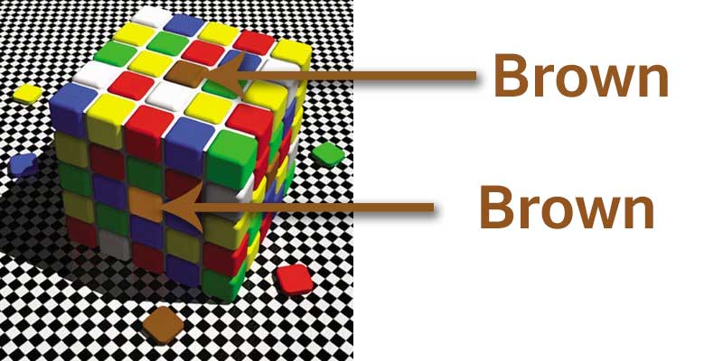
Differences in color perception can be illustrated below. The first image shows how a brownish square looks different when actually they are the same. It is because the shadows cause us to create differing color perceptions in our minds that we think they are different when they are not. This is almost exactly what happened with that painting described above.
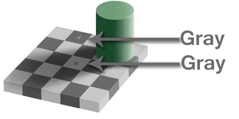
This second image is basically the same thing. Shadows influencing our perception of colors. The gray squares are virtually identical. If you don't believe me try it yourself with the eye dropper tool in Photoshop. Also notice how it looks like the arrows have a gradient applied to them going from left to right when actually they are a solid gray.
With these examples your mind is trying to determine the color it is processing but in the process you subconsciously are removing the lighting and background colors. So next time a color does not quite look right, don't discount the surrounding imagery as having some influence. Take a color sampling and see if it is the color you are after.
Giclee Printing at FinerWorks
One of the largest ranges of paper selections, while using the highest level of archival print technology allowing superior detail and color, you can create custom giclee prints of your artwork and photos.